
Accessibility Tips
OK, so this is actually a top 13 list, but that doesn’t really sound as nice. So, welcome to the TELT top 10 list of easy things you can do to make your courses and resources more accessible for students with disabilities and dyslexia, with three extra bonus items.
- Make Q-Review recordings available.
- Make Q-Review ‘audio only’ files available and downloadable.
- Use reading lists (Talis) on QMplus
- Make resources/notes available beforehand
- Use ‘alt’ text where appropriate when uploading pictures to the web
- Save filenames using understandable names
- Minimum font size of 18 in PowerPoint presentations
- Wherever possible spread out text across multiple pages/slides
- Use appropriate colour schemes on resources and screens
- Use easily readable fonts
- Bonus: QMplus Accessibility Checker
- Bonus: Screen Reader Helper
- Bonus: Microsoft Office Accessibility Checker
1. Make Q-Review recordings available
Q-Review is the QMUL lecture recording system, which gives students the ability to view lectures after they happen. This can be extremely useful for students unable to attend, or for students who need to review the material to fully understand the content. This is particularly useful for students who have visual or audio impairment and for students who suffer from learning disabilities such as dyslexia. Find out more in our Q-Review guides .
2. Make Q-Review audio recordings available and downloadable.
Watching Q-Review videos is the most common way to revisit lectures. However, allowing your students to download just the audio can also have benefits. Audio allows students to listen to the lectures wherever and whenever, via podcast apps on their smartphones or other listening devices. The files are also much smaller than their video counterparts so can be quicker to download and don’t take up room on smart devices.
3. Use online reading lists (Talis Aspire) on QMplus
Talis Aspire is an online resource list management system where staff can create reading lists using simple drag and drop tools. Library linking, acquisitions alerting and resource location functions make it easy for learners to connect with the library and find what they want.
It provides students with easy access to relevant lists, and to materials on those lists, through links to the Library catalogue, electronic books and journals, and other resources. For students with accessibility needs, this could be a lifeline for accessing readings and resources. The digitised content allows the students to use other technology tools such as screen readers or braille readers to make the resources even more accessible.
See this link for more information
4. Make resources/notes available beforehand
Releasing lecture notes before lectures allows students with accessibility needs to convert the notes into a more user friendly, readable format for them (using screen or braille readers), and allows them to digest the information. The final point is very important for students who have dyslexia and ensures they can be as ready as possible for the lectures.
5. Use ‘alt’ text when appropriate when uploading pictures to the web
‘Alt’ text (alternative text) is text that can be placed alongside an image when it is updated. This text is generally used for when the image cannot be displayed. However, is also used by screen readers for individuals with visual impairment. Making sure this is filled in ensures that those who are unable to see the image can know what it is and enhance their learning experience.
6. Save filenames using understandable names
Another tip to help those that use screen readers is to make sure file names are named appropriately. This will help those not able to see the screen to understand files that the computer or website may be referring to. The screen reader saying “E-Learning Assignment Feb 19.doc” is much easier to understand than “elu554823.doc”.
7. Use a minimum font size of 18 in PowerPoint presentations
For students with visual impairments PowerPoint or other presentation viewing software can often be difficult to read. Making the font that is used much bigger can make a real difference. The general rule for presentations is to not use anything smaller than size 18.
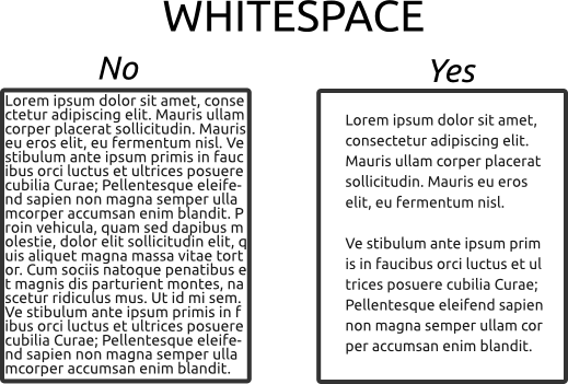
8. Use white space to make things clearer
When designing presentation material or resources of any kind, the appropriate use of white space can be a huge help in improving the viewing experience for students with accessibility needs. White space is the amount of space around pictures or text. As can be seen in the image below, text with white space (right) is much easier on the eye than text on the left.
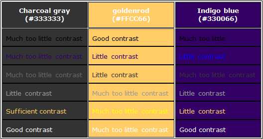
9. Use appropriate colour schemes on resources and screens
When creating resources to be presented on screen or on paper, make sure to use colours that contrast with each other as much as possible. Black and white is a great example of contrast. An example of good and bad contrasting colours can be seen below.
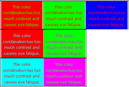
There are also colour combinations that can cause eye fatigue. These should be avoided. Examples are below.
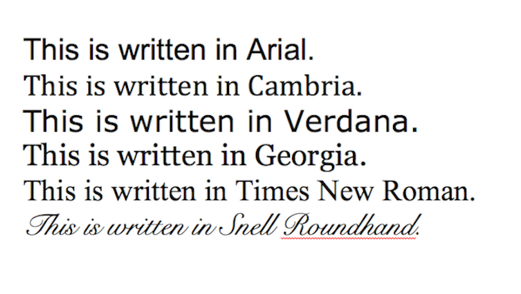
10. Use easily readable fonts
It’s not always possible to change fonts, but wherever you can, try and use fonts that are easy to read. Great fonts to use are sans-serif fonts, such as Tahoma, Arial or Verdana (the first and third in the image below). Try and stay away from fonts that are elaborate.
That concludes the official top 10. However, there are a few other tools that can help you to incorporate them all in your practice. Tools that check your creations can be extremely useful for guidance and the bonus points below discuss three of them.
Bonus 1: QMplus Accessibility Checker
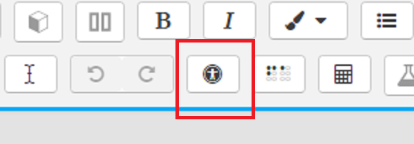
One of the tools available in the QMplus text editor is an automated accessibility checker which checks for some common errors in the text such as:
- Images with missing or empty alt text
- Contrast of font colour and background colour
- Whether long blocks of text are sufficiently broken up into headings
- Whether tables have captions
You will notice some of these points have already been mentioned previously. So, this tool can be used to check that points 1 to 10 are being followed.
Bonus 2: Screen Reader Helper
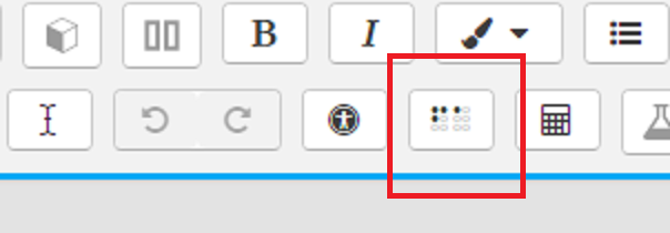
Another tool in the QMplus text editor is the Screen reader helper. This helps to check whether your page will run into problems with screen reading technologies such as screen or braille readers.
Bonus 3: Microsoft Office Accessibility Checker
One largely unknown but fantastic feature of MS Office application is the Accessibility Checker. This is a tool that can analyse your MS Office files or emails for accessibility and give you hints on how to improve them.
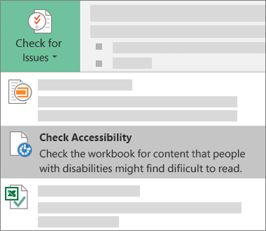
On newer versions of MS Office applications, you will find the button in the Review ribbon. For older applications, you can find the tool in File -> info -> Check for Issues.
Conclusion
Making your course more accessible doesn’t just help those with disabilities or dyslexia, it makes your resources and presentations more appealing to all students. Many of the above items are also fairly closely linked to each other. For example, bonus point 1 helps to check for point 5 and point 9. So once you have checked for one, it is easy to check for another. For those that want to look into doing more, please see the additional resources below, or contact the E-Learning Unit for some one-to-one guidance, through our BALT sessions (Book a Learning Technologist).
Other useful resources:
- Advice for QMUL Staff from the Disability and Dyslexia Service Website
- Advice for QMUL students from the Disability and Dyslexia Service Website
- Create and verify PDF accessibility
- Tips for Getting Started Designing for Web Accessibility
- Accessibility Basics: Designing for Visual Impairment
- Make your PowerPoint presentations accessible
- How to design websites for blind and partially sighted people
